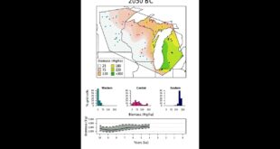
A visualization animating the reconstructions of Midwestern biomass over the last 10,000 years. In the top chart, areas of deeper green indicate regions with higher magnitude of biomass. The bar charts show the changing distribution of biomass in grid cells within each of the three sub-regional clusters. The line chart …
Read More »Modeling historical biomass could be key to buffering climate change